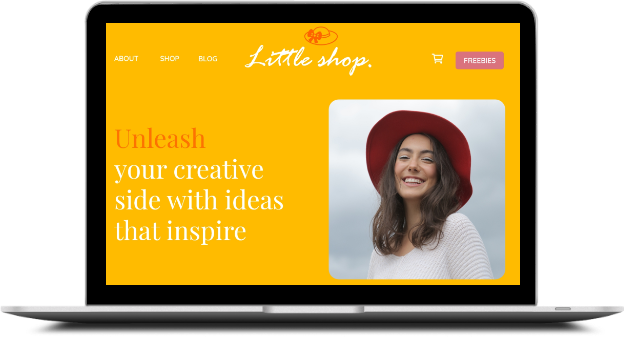
webpage screen

Little Shop

Little Shop is a self-crafted case study created to inspire solopreneurs and small business owners. The product includes concept branding, UI design and digital marketing assets created from grass root to completion.

View Webpage >
 

The Goal

Little Shop's owner is a talented DIY crafty person. She started out as a hobbyist but soon converted her passion to an online business. She wanted a website that was 100% her. She wanted a brand name that represented her personality and expertise. She also had no experience with digital marketing and was looking for someone to help with her advertising requirements.

Excited to guide her through the process of branding and digital marketing, I set out to create a fresh brand kit, polished messaging and copy, UI templates and digital assets.

LOGO DESIGN

Process

A small idea can turn into a big venture therefore the name "Little Shop". The font Rage is a casual brush scripted font with a feminine, ornate arty appeal to it. The hat represents prestige and empowerment. The owner wears several hats to reach her business goals.

littleshop logo

COLORS & FONTS

I chose a vibrant color palette to reflect her bright and positive energy.

To create an elegant yet modern look that matches the owner's confidence and candor, I used Quicksand bold for headings and Qicksand light for body text. I also used Kaisei HarunoUmi sparingly to make a statement.


Yellow - #FFB115


Cream - #FEC759


Gray - #777267


Pink - #DA727E

Quicksand

Designed by Andrew Paglinawan

It has rounded letterforms giving it a warm and friendly appearance.

Kaisei HarunoUmi

Designed by Claus Eggers Sørensen

Its high-contrast stokes place it more in the modern category

WEBSITE

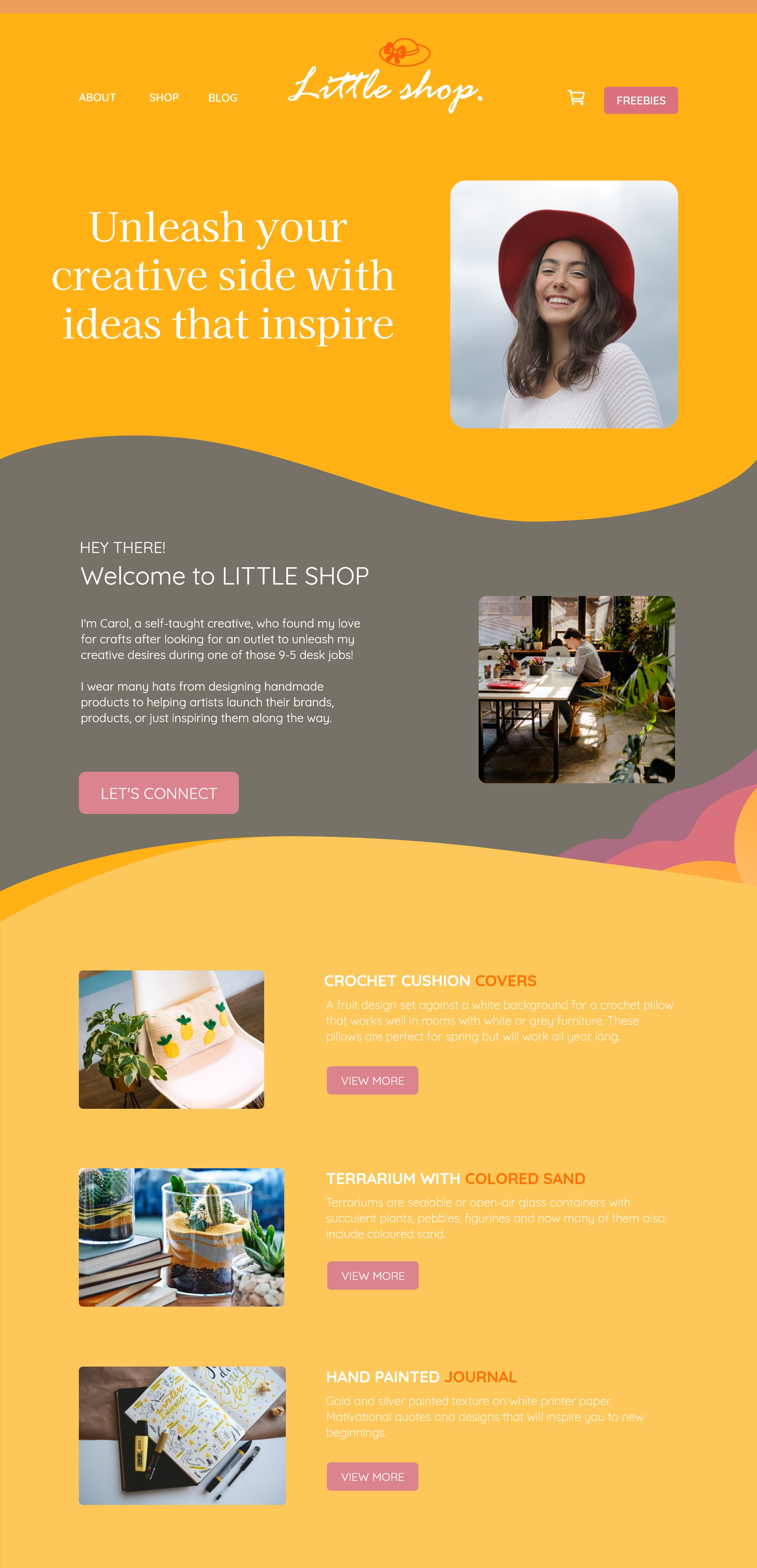
webpage first half
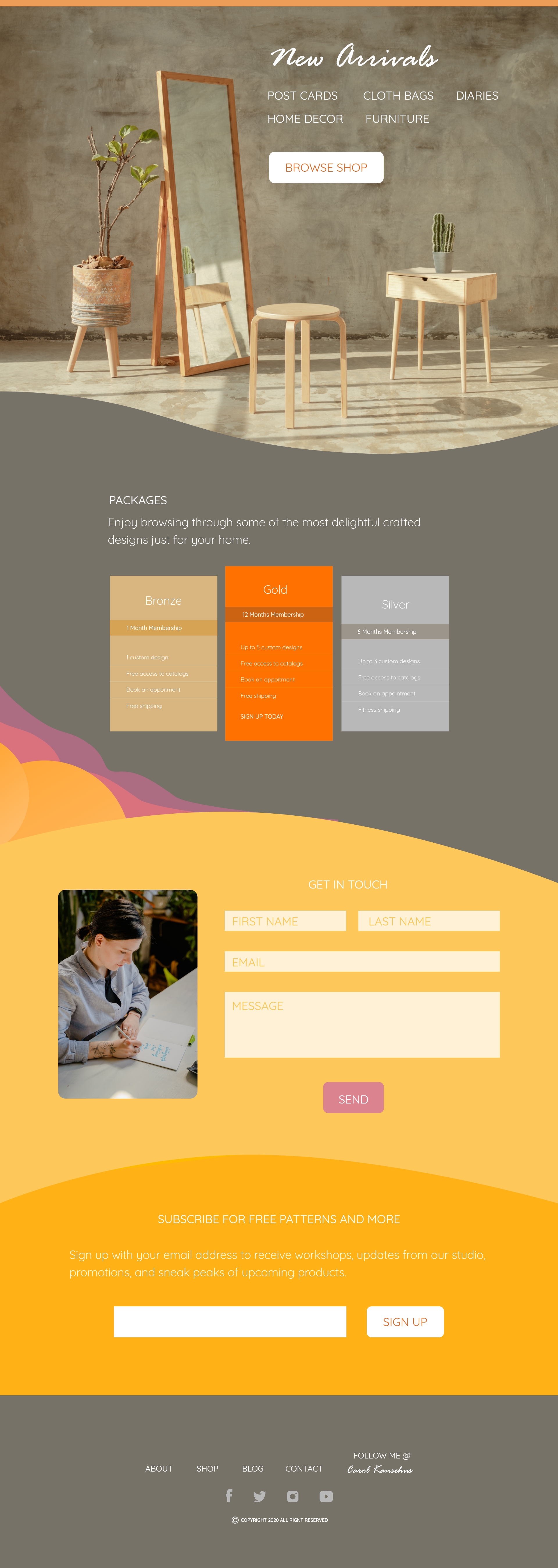
webpage second half

The webpage was designed using Adobe XD with a size of 1920px x 1080px. It includes the main navigation and logo in the header section, followed by a summary about the owner, her three popular selling products, new arrivals section, package deals, a form to connect with her, a subscription section and social links in the footer section.

VIEW LAYOUT


BANNER ADS

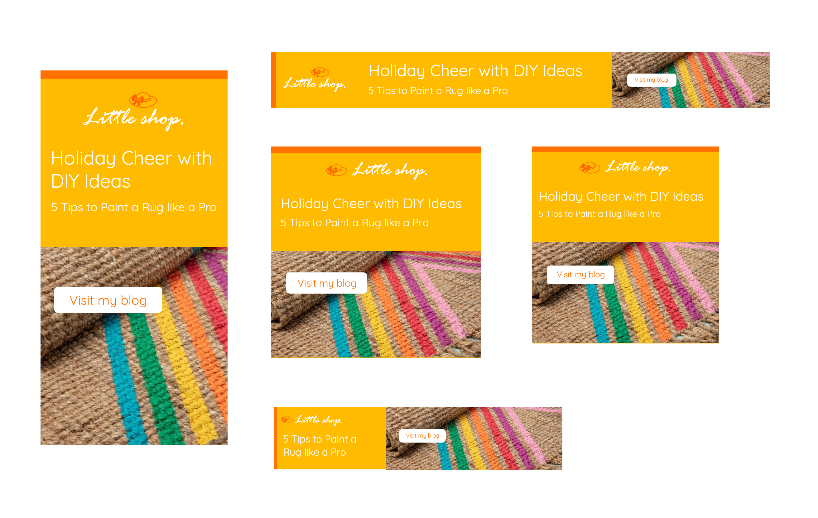
banner ad

E-NEWSLETTER

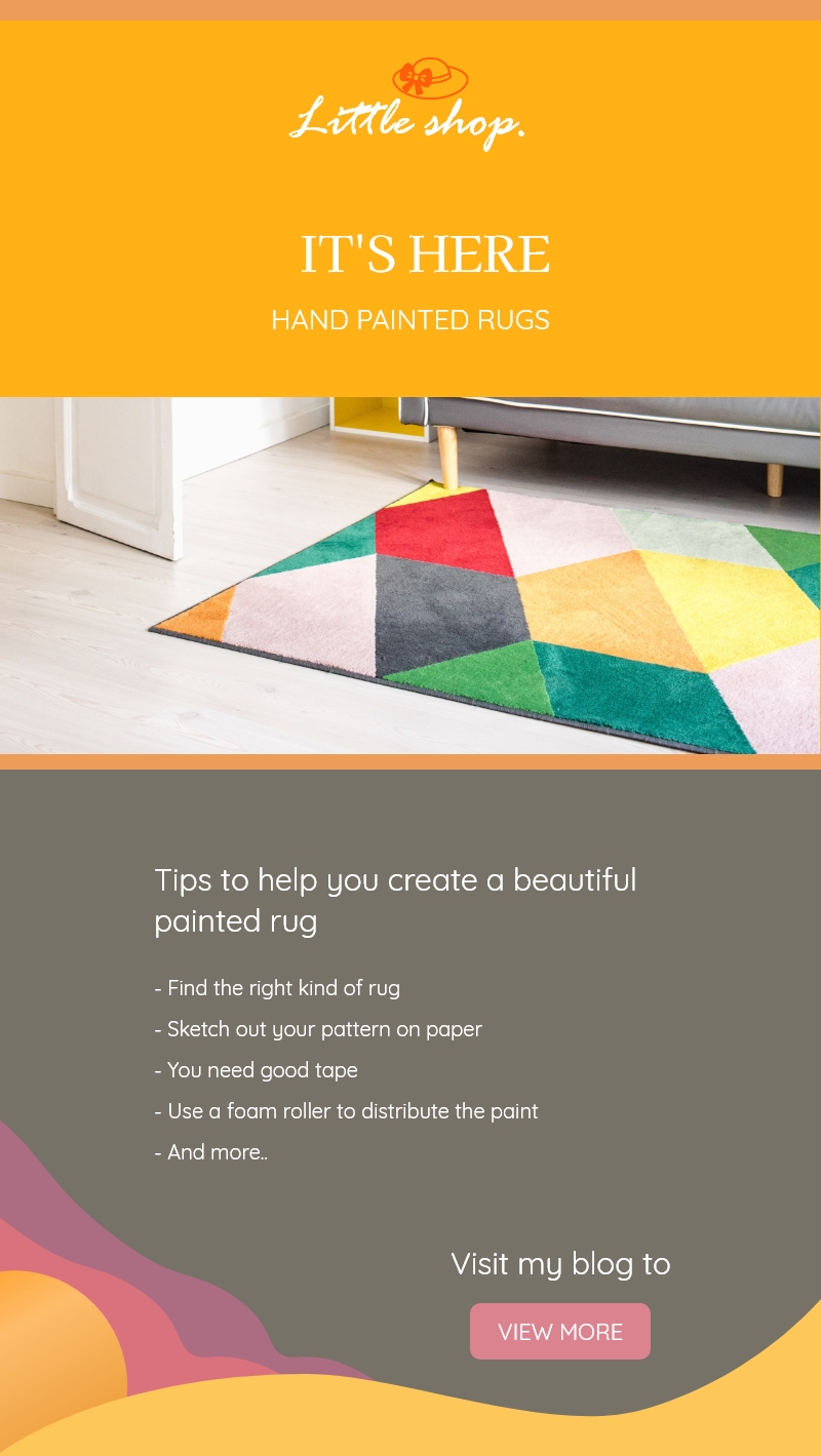
enewsletter

I created an e-newsletter to showcase the clients brand personality and provide the audience with updates on new products.

The Goal - Hand painted rugs was a new product and my client wished to convert her audience into prospective buyers.

The Process - Providing useful tips for DIY hand painted rugs helped build relationships. Also providing a call-to-action button helped capture a niche group of customers and convert click into sales.


View E-Newsletter >

GET IN TOUCH

Do you want to know more about me or my work?
Or do you have a cool project you need help with?
Drop me a line and I'll be happy to help!

E: pixeldesign@gmail.com

VIEW RESUME